TOP
2024

Deliverables
UX Audit · User Flows · Wireframes · Prototypes · High-Fidelity UI · Edge Case Documentation · Developer Handoff
Industry
Transit · Mobility · Fintech · Consumer Mobile
Tools
Figma · Miro · ChatGPT


The app had a structural problem, not just a visual one. Critical actions were buried. The QR section showed no difference between active, used, and shared tickets. Payment failures had no recovery path. New users had no onboarding. And the platform needed to absorb Pix and QR code payments without breaking any of the flows that already existed. The reviews said it clearly. "Too many steps to buy a ticket." "I got stuck at the subway station because the app wouldn't log in." "The worst experience I've ever had buying a metro ticket." That was the baseline I was designing against.
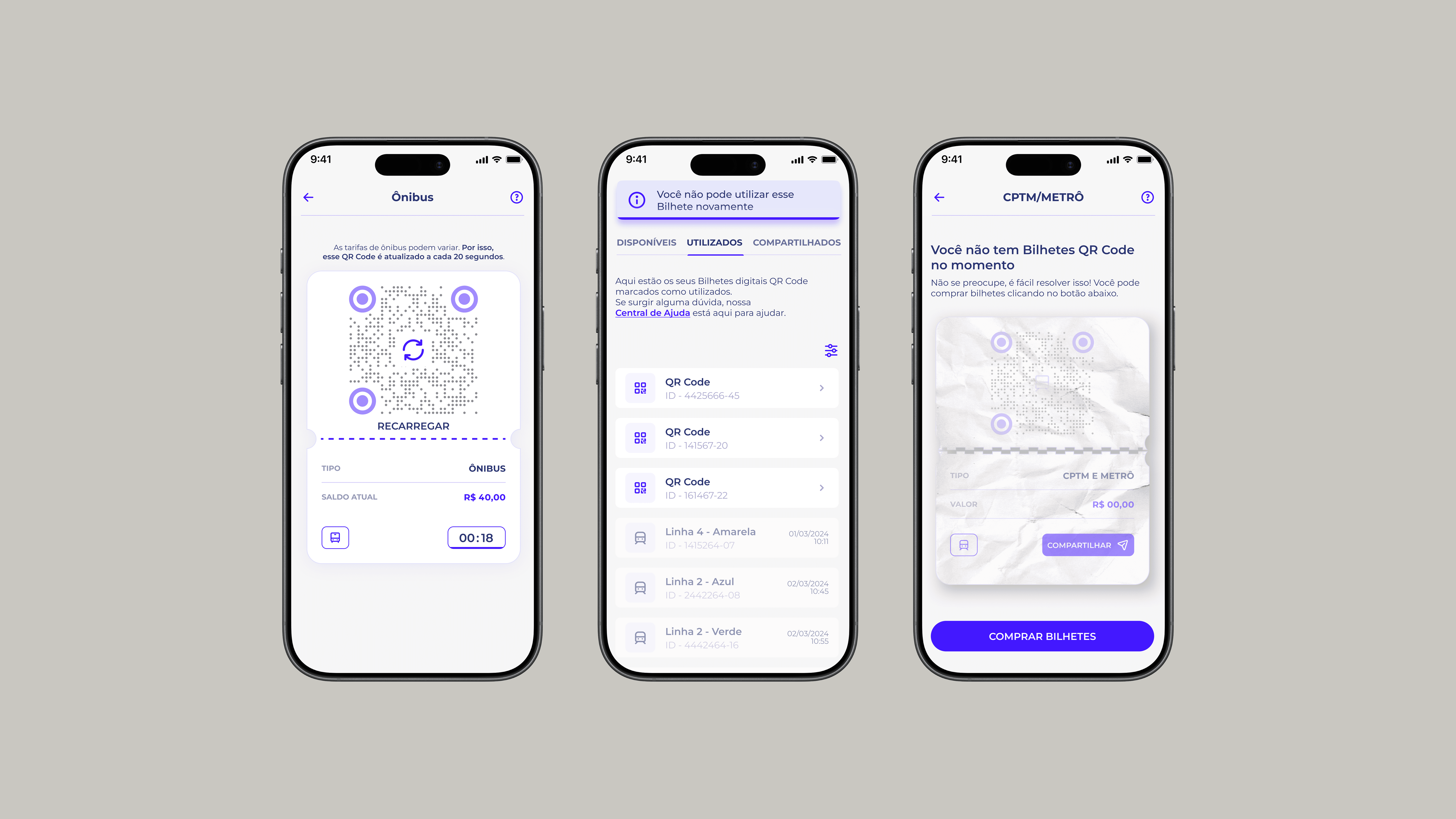
The biggest call was how to handle the QR ticket section. The existing design showed all tickets in a single list with no visual differentiation. Used tickets looked identical to active ones. Shared tickets had no status indicator. At a turnstile with people behind you, that ambiguity isn't just frustrating, it causes real problems. I could have added filters or sorting. Instead I separated the states entirely: active tickets, used tickets, and shared tickets each became their own view with distinct visual language. It added a navigation layer but removed the cognitive load at the moment that mattered most. That tradeoff was the right one.
The redesign shipped within the 13-week timeline. In the first quarter post-launch, customer satisfaction improved 20% and checkout completion rose 10% following the simplified ticketing flow and introduction of Pix and QR code payments. The app rating moved from 3.0 to 4.3 across nearly 300K reviews. For an app at this scale, that kind of shift doesn't happen without the core flows actually working better for the people using them every day.
No research data meant I had to work differently. I used public reviews as a proxy for user pain, reading through hundreds of complaints to find patterns. Login failures, ticket confusion, payment dead ends, those weren't random bugs, they were systemic UX failures that pointed directly at where the flows broke down. I mapped every edge case I could find before touching any UI, then built the documentation tight enough that developers could implement without interpretation. Weekly design QA with the dev team kept what shipped aligned with what was designed.