NEST
2025

Deliverables
UX Strategy · Information Architecture · UI Design · Design System · Prototypes · Content Guide
Industry
Fintech · Personal Finance · B2B SaaS
Tools
Figma · Gemini

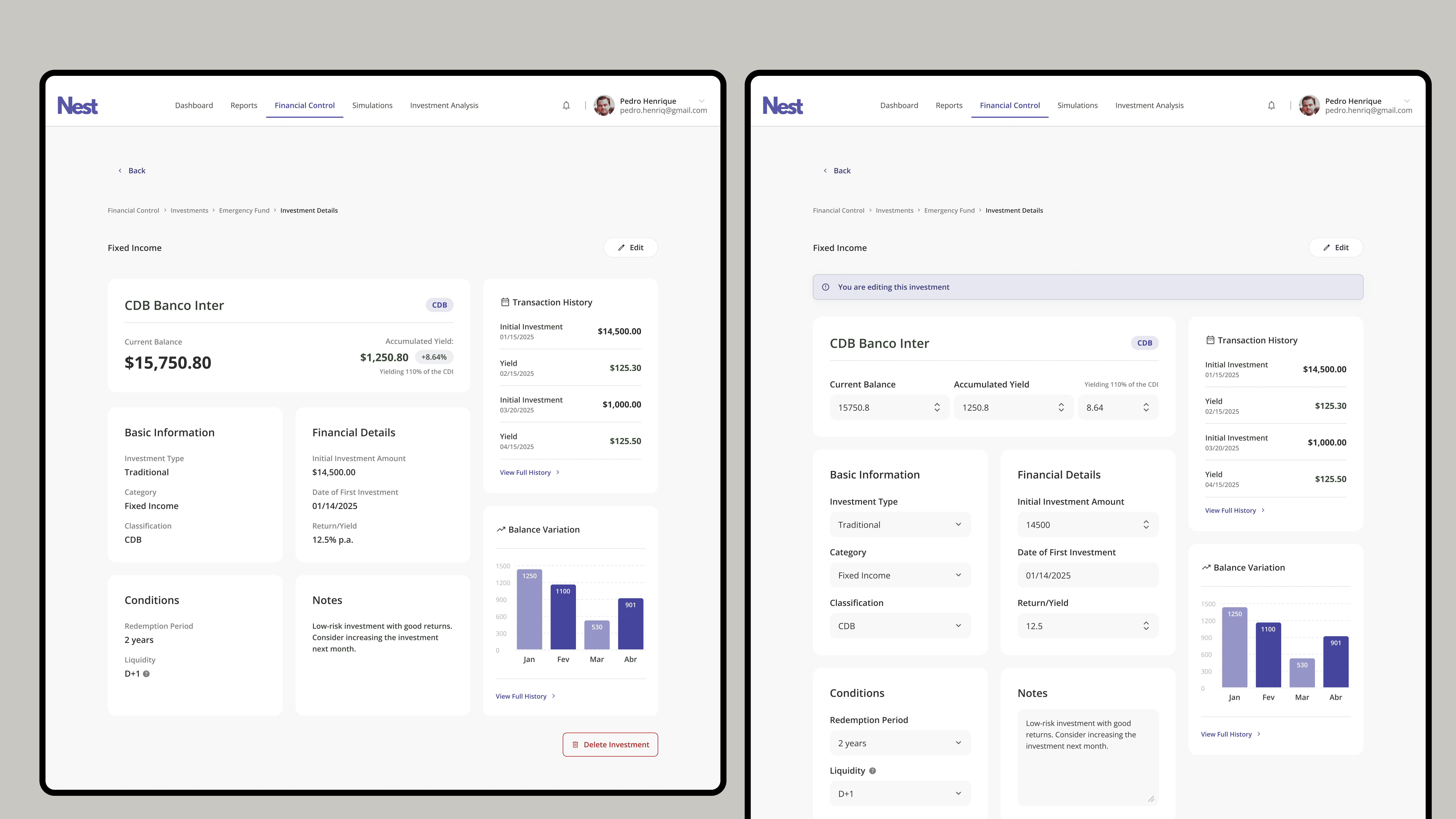
Financial platforms usually fail in one of two ways. They either oversimplify and lose the people who actually have complex finances, or they show everything at once and overwhelm everyone else. Nest needed to work for a 28-year-old building an emergency fund and a business owner tracking corporate spend, in the same product, without either experience feeling like a compromise. On top of that, most fintech products treat data as the destination. The user opens the app, sees numbers, and closes it. That wasn't good enough here. The data needed to tell someone what to do next.
The biggest decision was how to handle investment categorization. The obvious approach was a table: list all assets, show balances, let users sort. Clean, scalable, familiar. I killed it. Instead I built a Categorized Investment Framework that groups assets by purpose, Emergency Fund, Financial Goals, Retirement, not by type. This comes from Mental Accounting, a behavioral economics principle showing that people make better financial decisions when money has a named job rather than sitting in an undifferentiated pool. It also solved the density problem: each category becomes its own workspace, so the interface stays scannable as the portfolio grows instead of becoming another wall of numbers. For the dashboard, I used a modular mosaic layout where each tile is both a data view and a navigation shortcut. The admin layer lets business owners toggle between a company health view and individual user metrics without leaving the screen. One product, two audiences, no context switching.
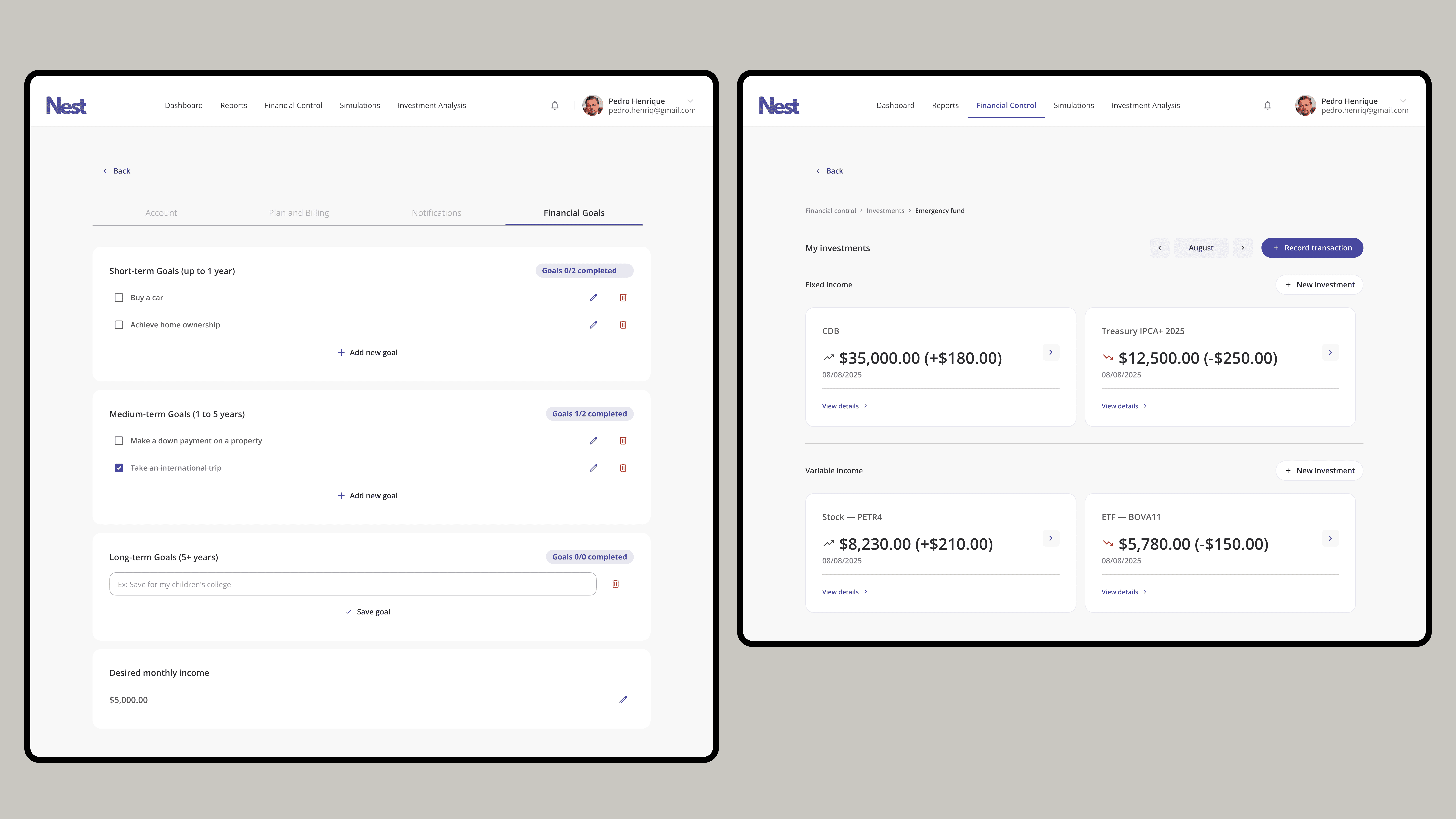
The hardest part wasn't the UI. It was figuring out what not to show. Every financial platform has a data problem: too much of it, not enough structure. The instinct is to display everything and let users figure it out. I went the other way. I mapped the decisions each persona actually needed to make, not the data they theoretically had access to, and designed the information hierarchy around that. The Mental Accounting framework came out of that process. It wasn't a creative choice, it was the logical answer to a specific problem: people don't manage money by asset type, they manage it by goal. The UI just needed to reflect how they already think.

